Website Design • 2022 - 2026
Over the past few years, I’ve worked on the design for nearly fifty websites in the tourism, travel and hospitality industries. The projects have varied wildly in scope, size and demands, but all pushed me creatively in different ways. Not to play favorites, but the following are a few of my favorite projects.
The Project
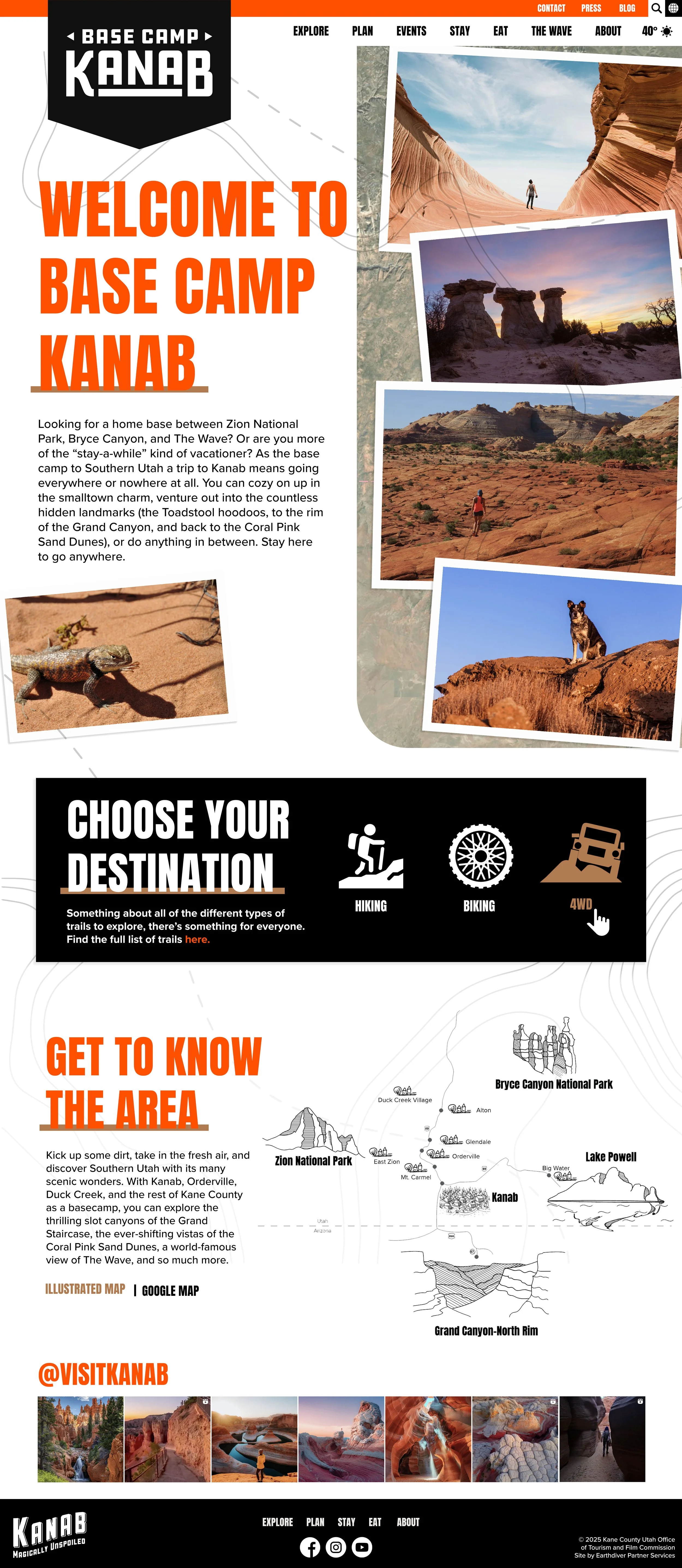
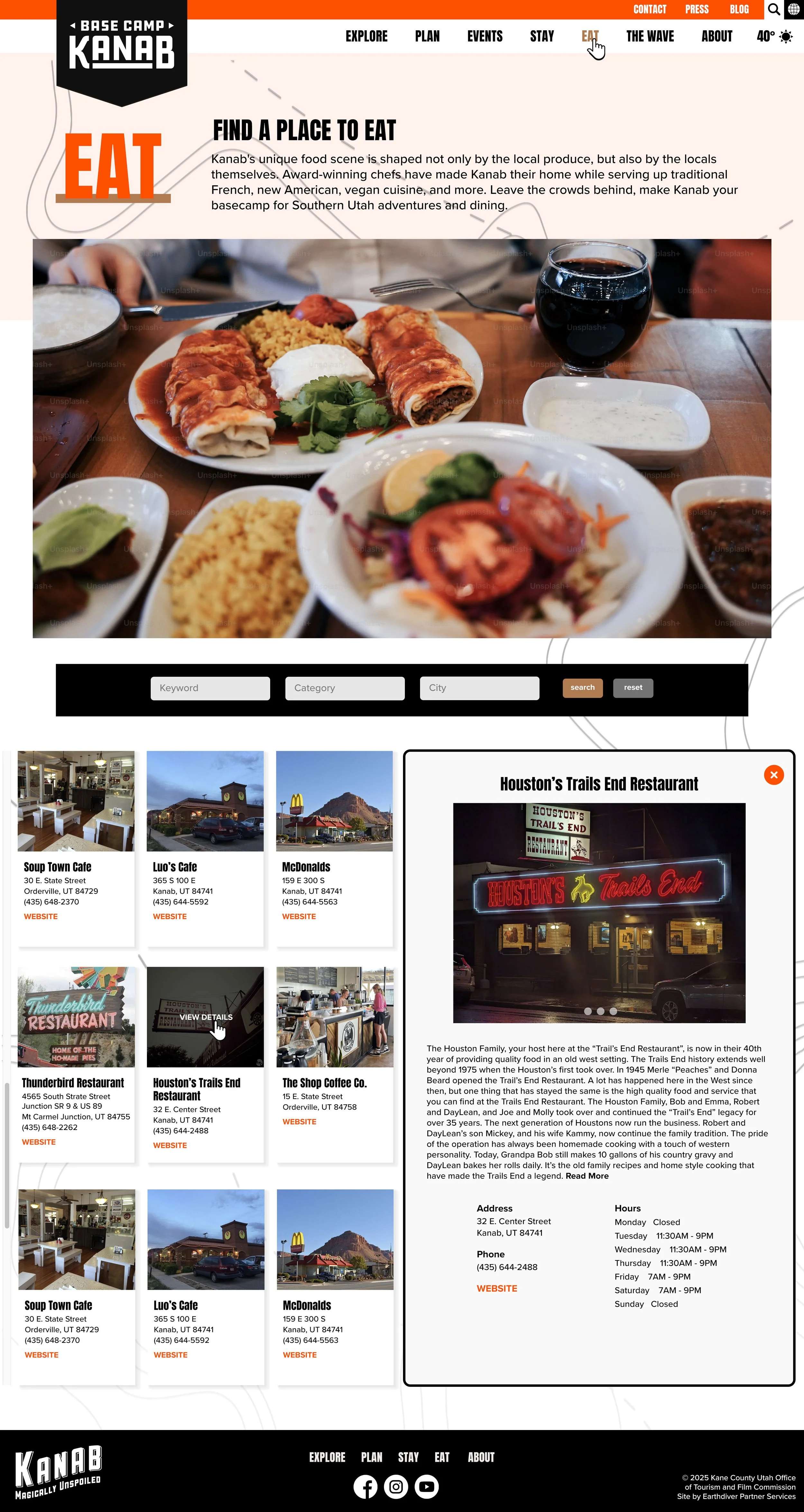
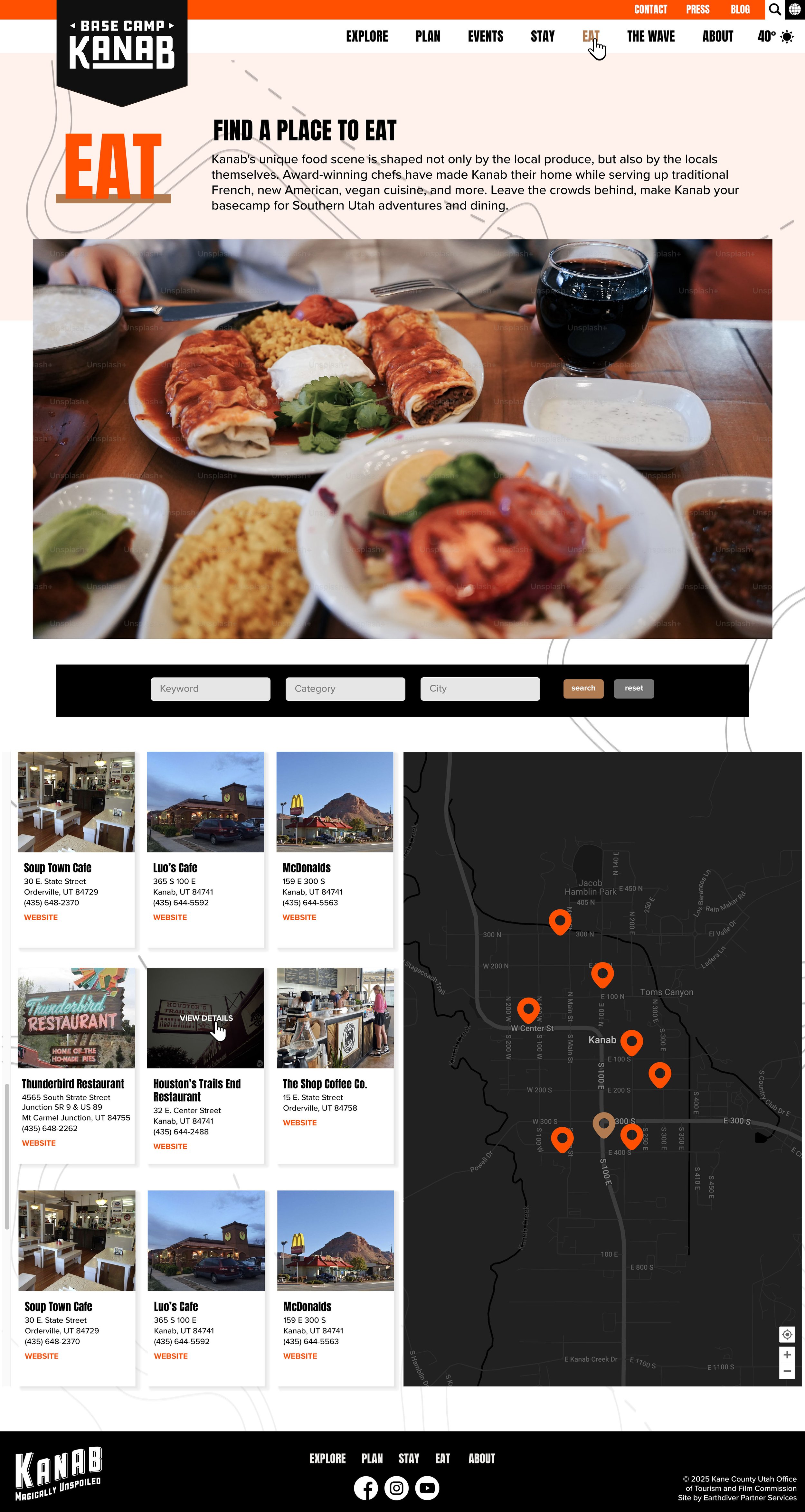
It’s always a treat when I get to work on a site for a place I love, and oh do I love Kanab. The team at Kane County came to us for a new site with better functionality and a refresh of their current look. I love a client that isn’t afraid to go bold, and Kane County definitely is not.
The Approach
Orange and black can very easily skew ‘Halloween’ so to avoid that, I amped up the brightness on the orange they were using and added in a tan accent color. Because the colors and display font are so in your face, I balanced that with a healthy amount of white space and, of course, the let the imagery of the area do a lot of the talking.
Visit Southern Utah Redesign
Client
Visit Southern Utah | Kane County, Utah
August 2025
The Project
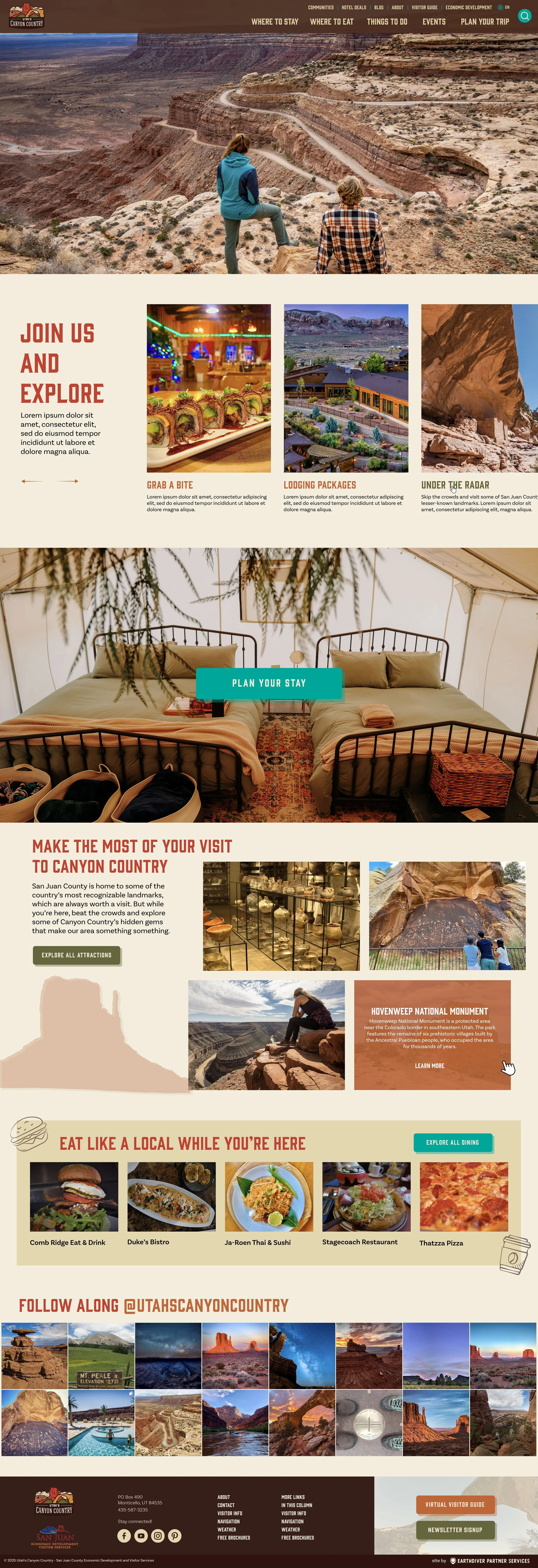
San Juan County is a beautiful and expansive corner of Southeastern Utah and was one of my first clients. We built their original website in 2022, and when it came time for an update, I couldn’t wait.
The Approach
Their old site relied heavily on beautiful scenic imagery - of which their is no shortage in SJC - but was very static. For the redesign, I wanted to incorporate much more movement into the site, as well as a number of hand-drawn illustrations to give it that little touch of life it had been missing.
Utah’s Canyon Country Redesign
Client
San Juan County Economic Development and Visitor Services | San Juan County, Utah
Original Website: 2022
Redesign: 2026 (in progress)
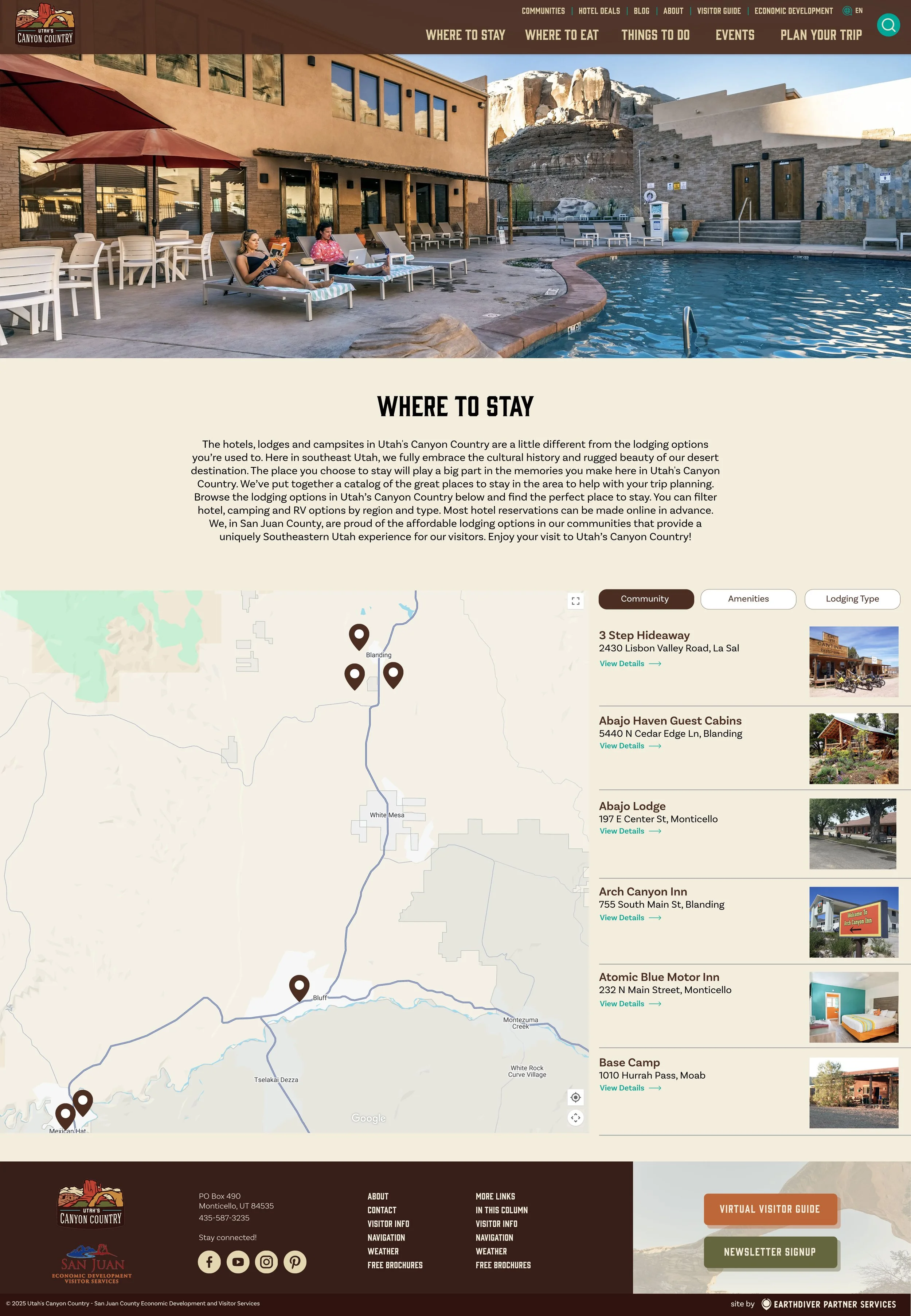
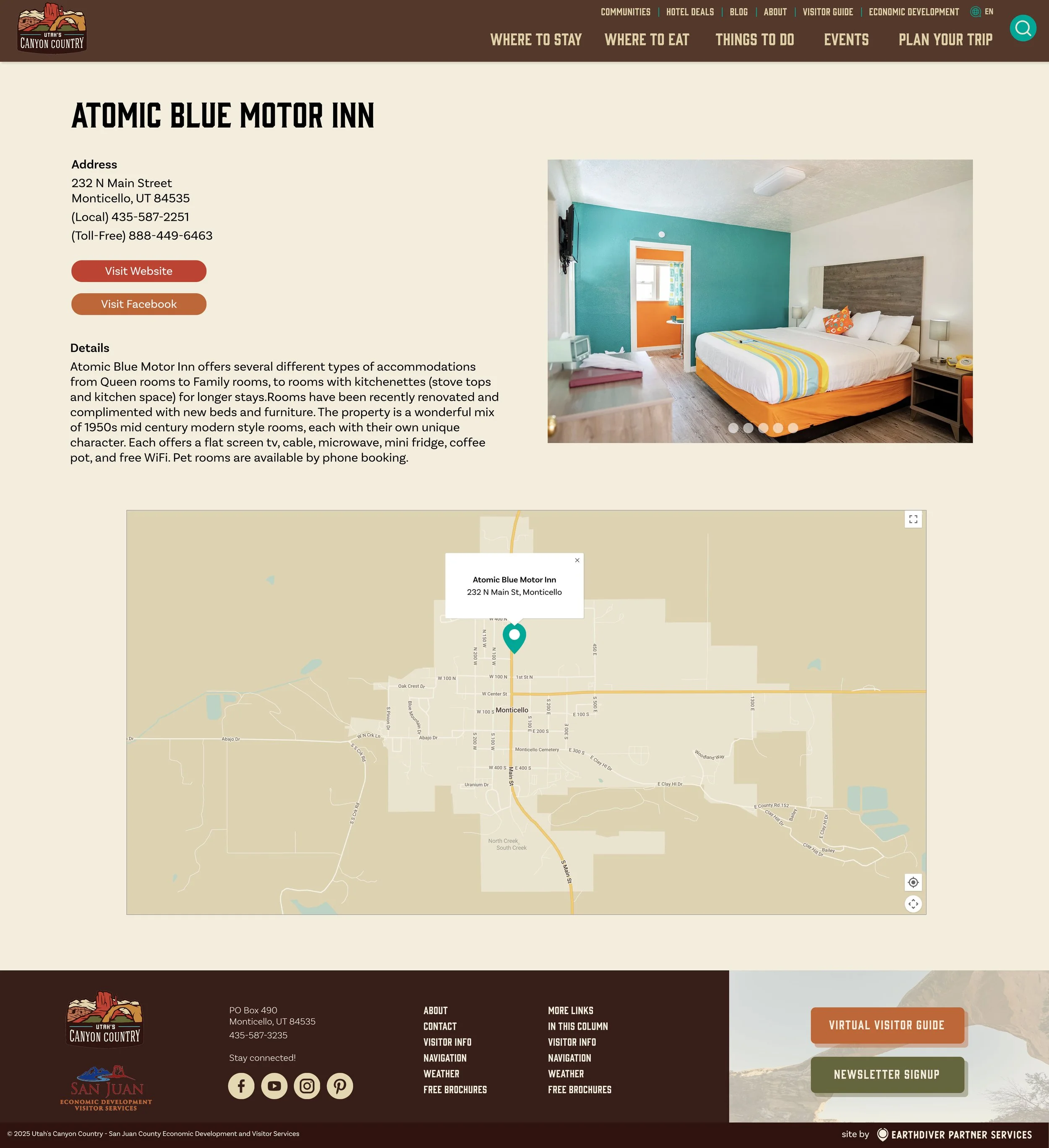
Because their area is geographically so diverse (read: it’s huge), for their topical search pages, I thought moving to a map-first design made the most sense for visitors to their site.
The Project
There are few things more iconic or Americana than Route 66, and partnering with the Arizona stretch the infamous highway has been nothing but fun. We built their first website in 2023, and at the start of 2026 in anticipation of Route 66’s Centennial gave it a refresh.
The Approach
I love projects where the directive from the client is ‘make it fun’ and I get to lean into whimsy. There’s so much history and inspiration with Route 66 to draw from, which I did with the custom road signs and even the choice of display font - the classic style that nods to the 66 of the original road signs.
Arizona’s Historic Route 66
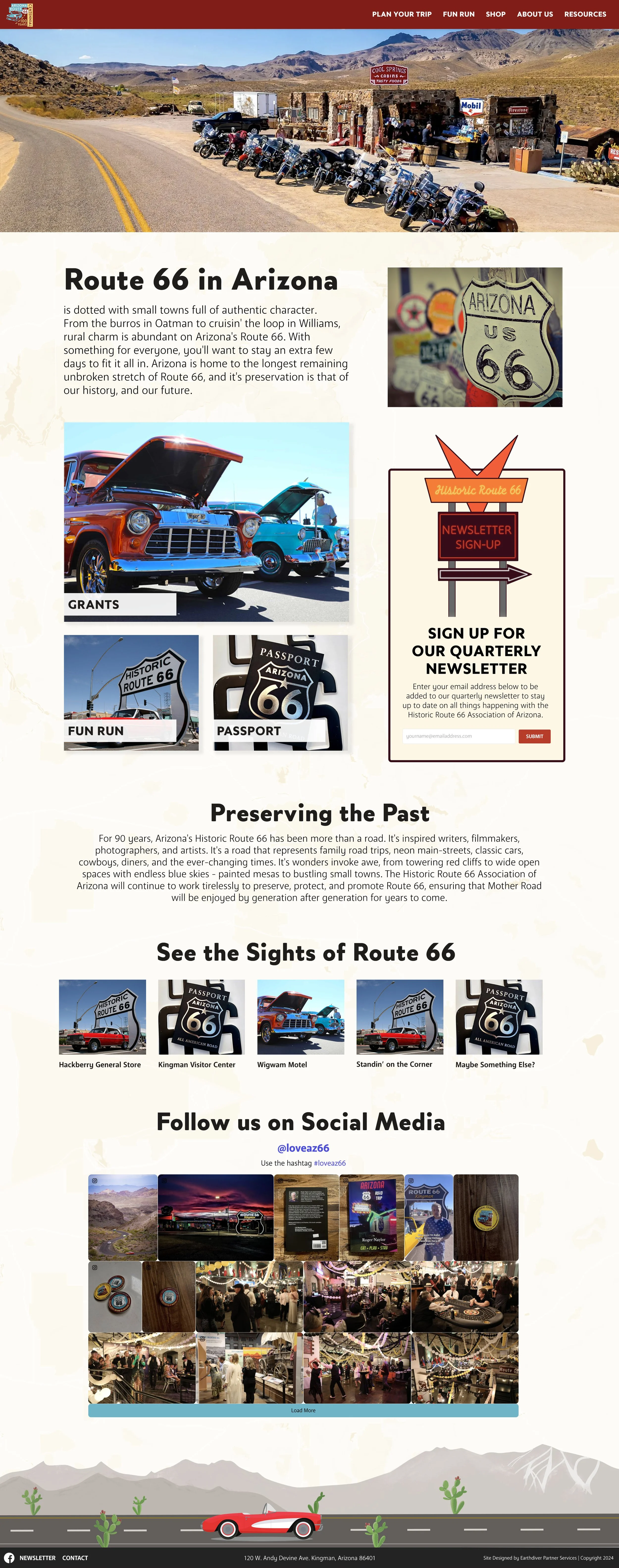
Client
Arizona’s Historic Route 66 | Arizona
Original Website: 2023
Site Refresh: January 2026
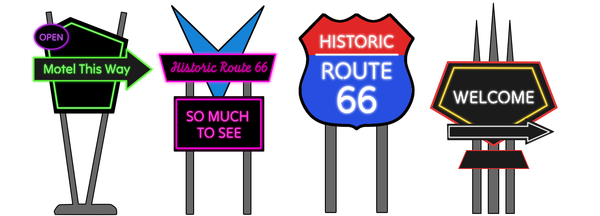
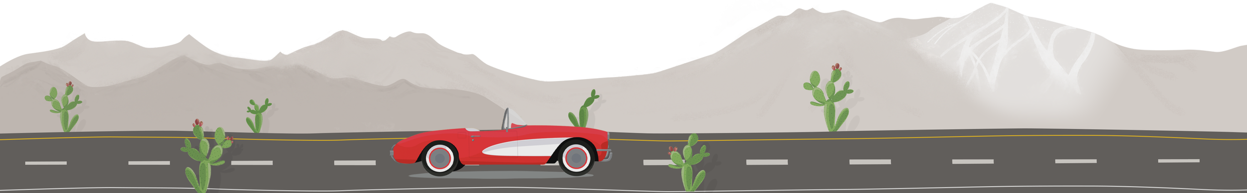
This project was especially fun because I got to work in some fun illustrations, like these custom Route 66 signs above, which were incorporated throughout the original site, or the footer illustration below.
Overhauling our Company Brand Identity
The Project
At the end of 2025, I was tasked with overhauling our company brand identity and designing a new website and I was able to design the exact website I envisioned with no client back and forth because this time I was the client.
The Approach
I wanted a bold layout and colors, a far cry from our previous look, with visually distinct sections on the homepage that made it easy to navigate. Because our company, at its core, is all about storytelling, I wanted the intro video to convey that and had our video editor create something using footage from some of our location sites. Throughout the rest of the site, one of my main goals was making sure it would be easy for the Sales team to update later when they had new projects or testimonials to highlight.
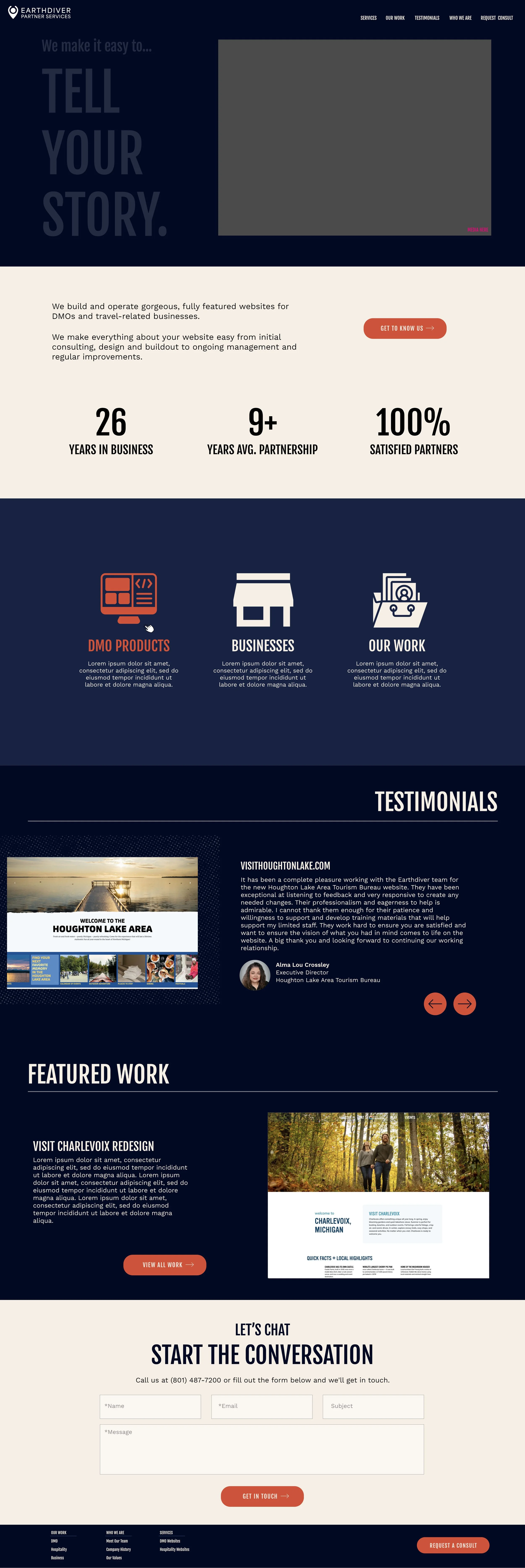
Client
Earthdiver Partner Services
2025
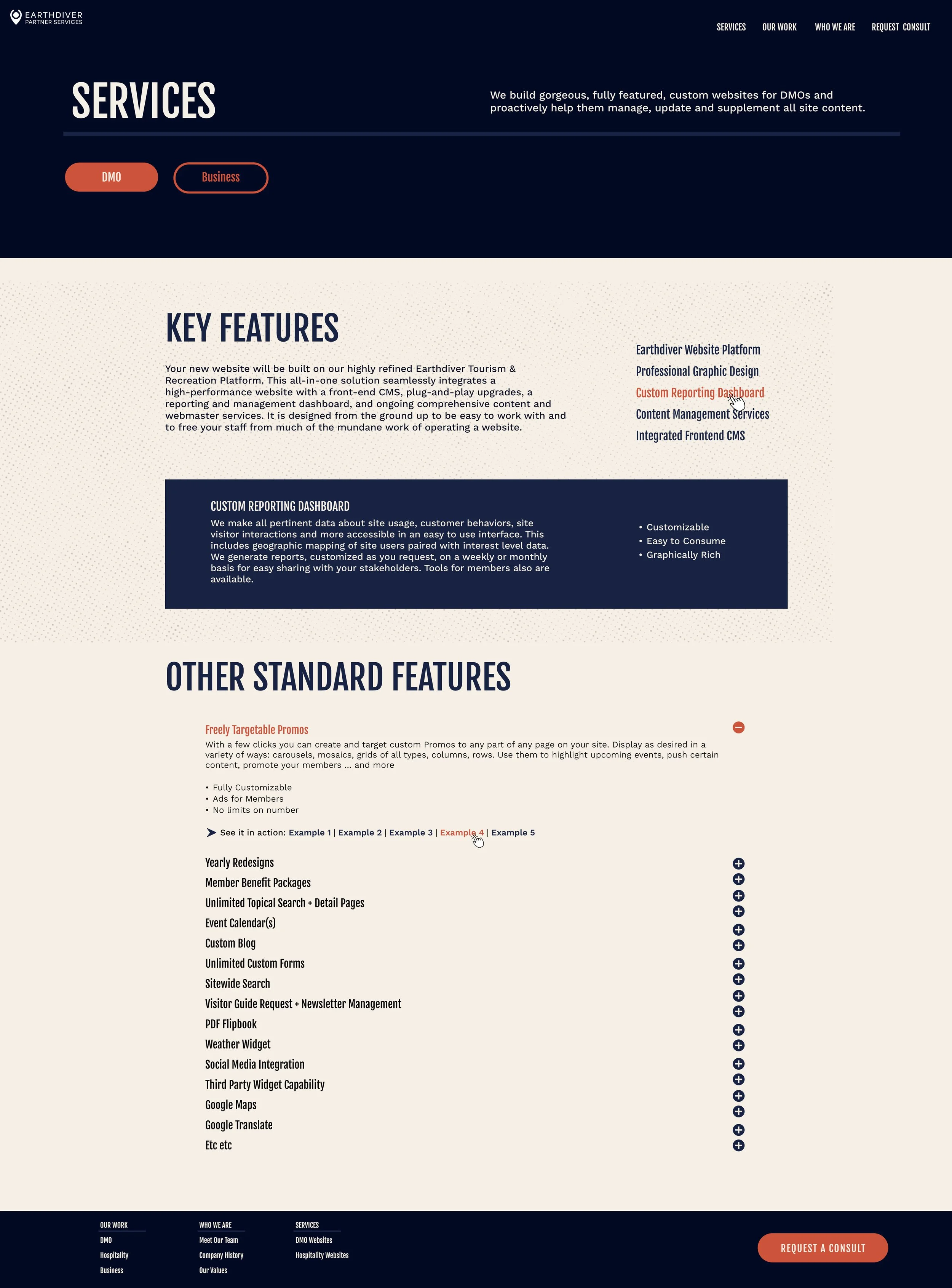
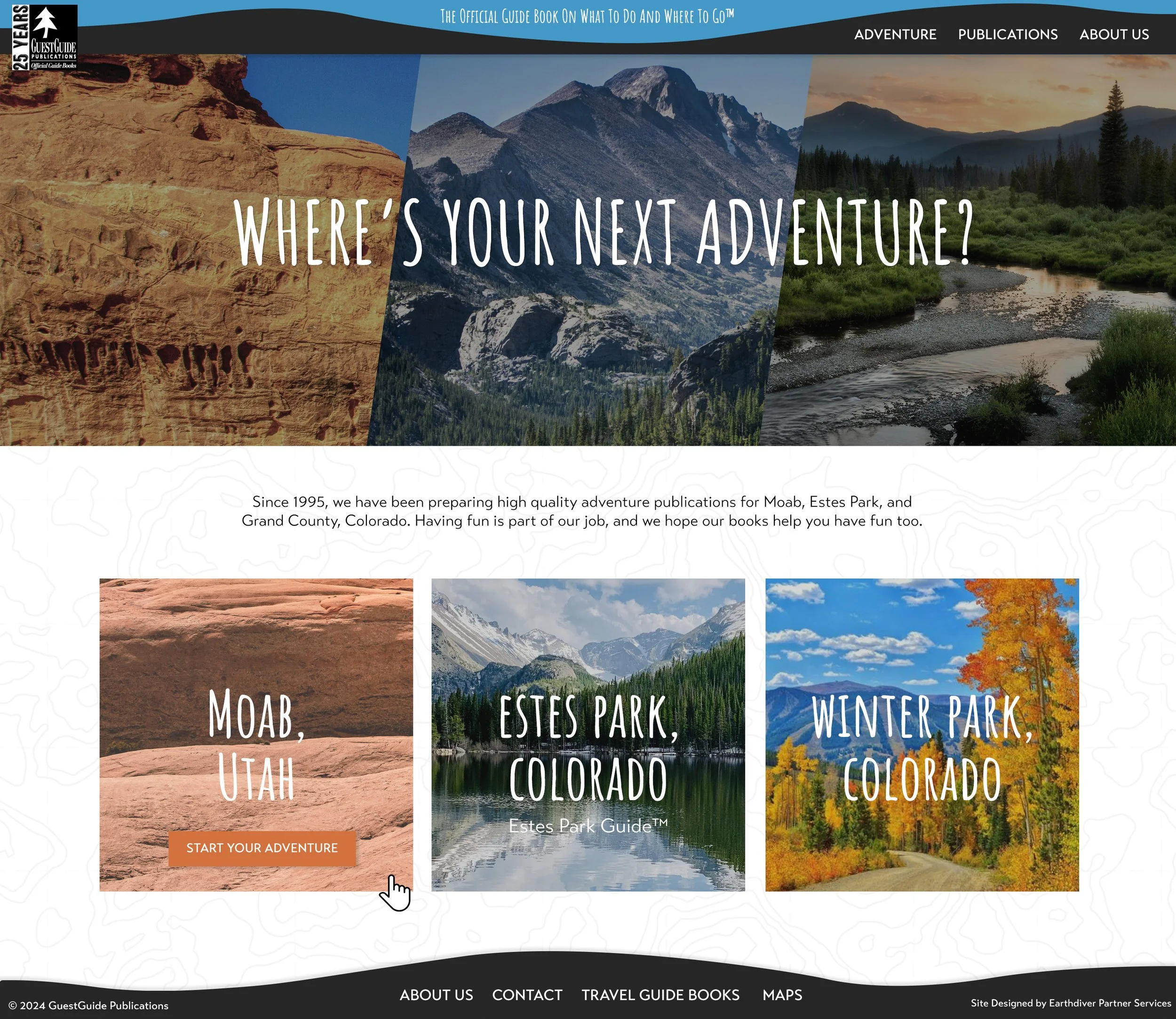
The Project
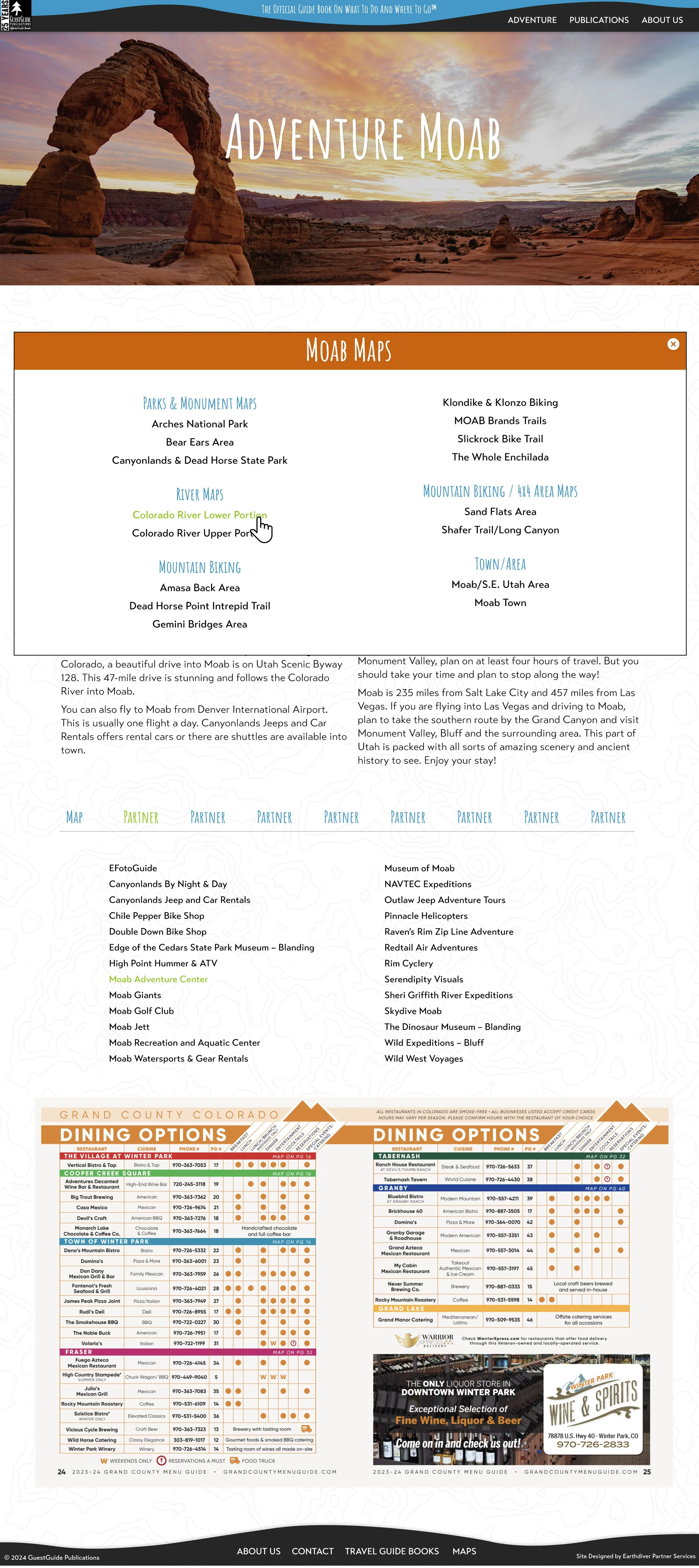
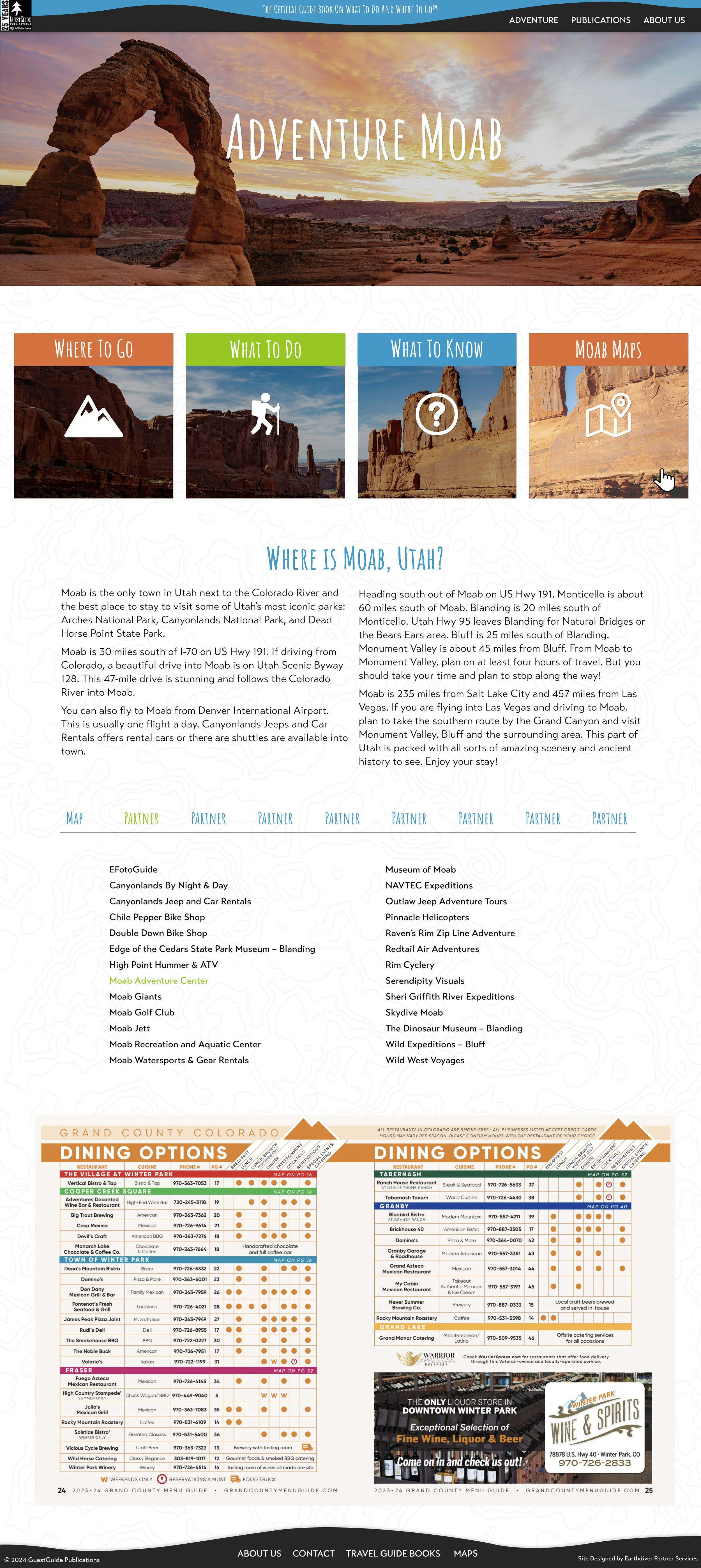
Guest Guide Publications publishes a series of guidebooks for areas like Moab, Estes Park, and Winter Park, CO, and came to us with a Wordpress site that was barely functioning and hard to update. This project really worked the left side of my brain because hidden within their site was a ton of information and links and figuring out how to organize and display all of it in a way that was usable and not overwhelming was a fun challenge.
The Approach
Guest Guides had their own unique brand identity coming into this project, so I played into that using their existing bold colors and playful font and working details like the topographic background pattern and icons into the site. To handle the information overload issue, I ended up using a combination of pop up boxes and tabbed sections to get all of their great info in without creating pages that left you scrolling endlessly.
Guest Guide Publications
Client
Guest Guide Publications
2024
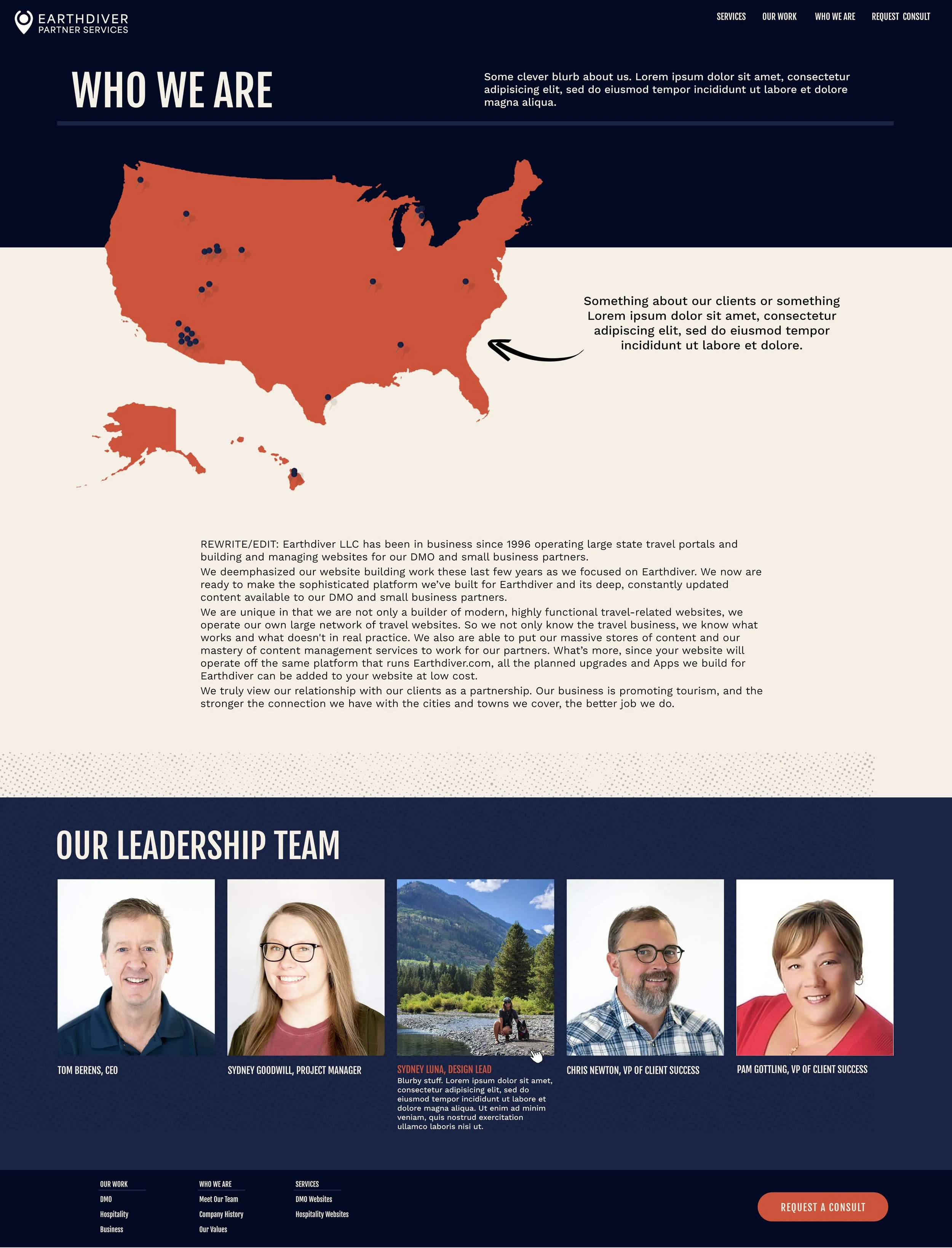
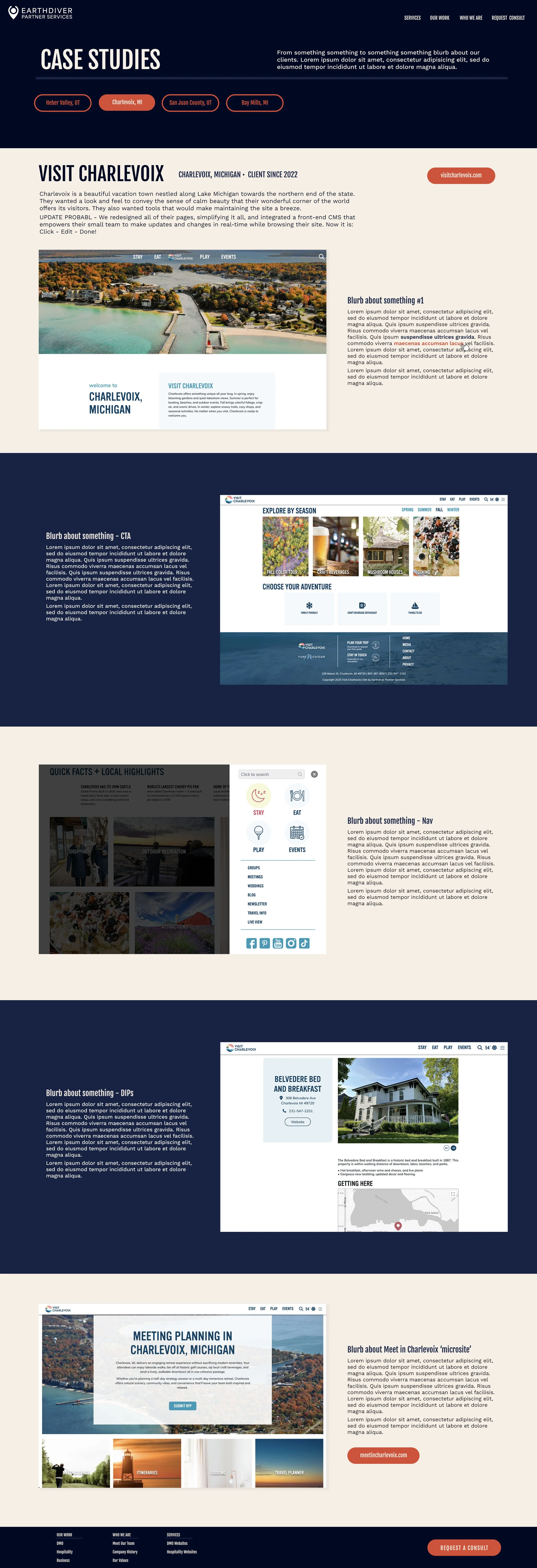
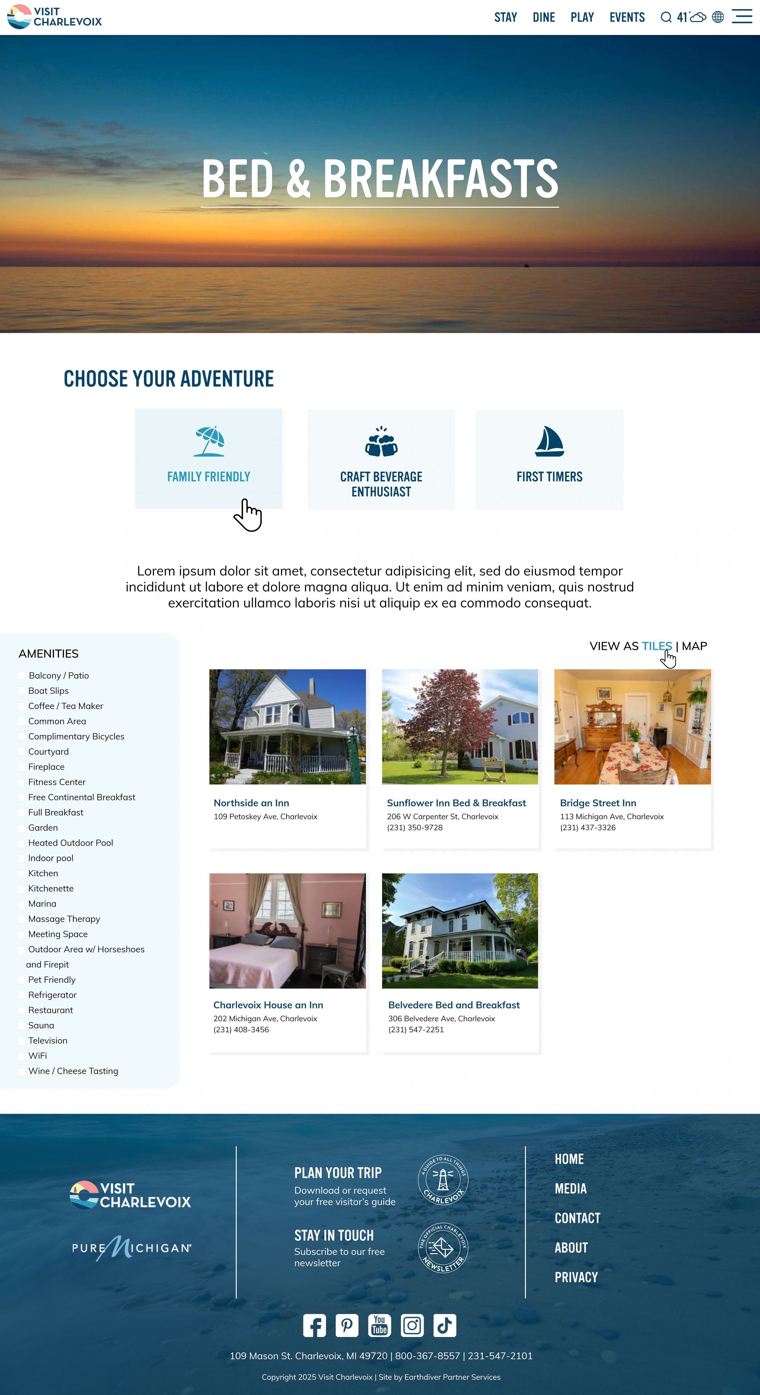
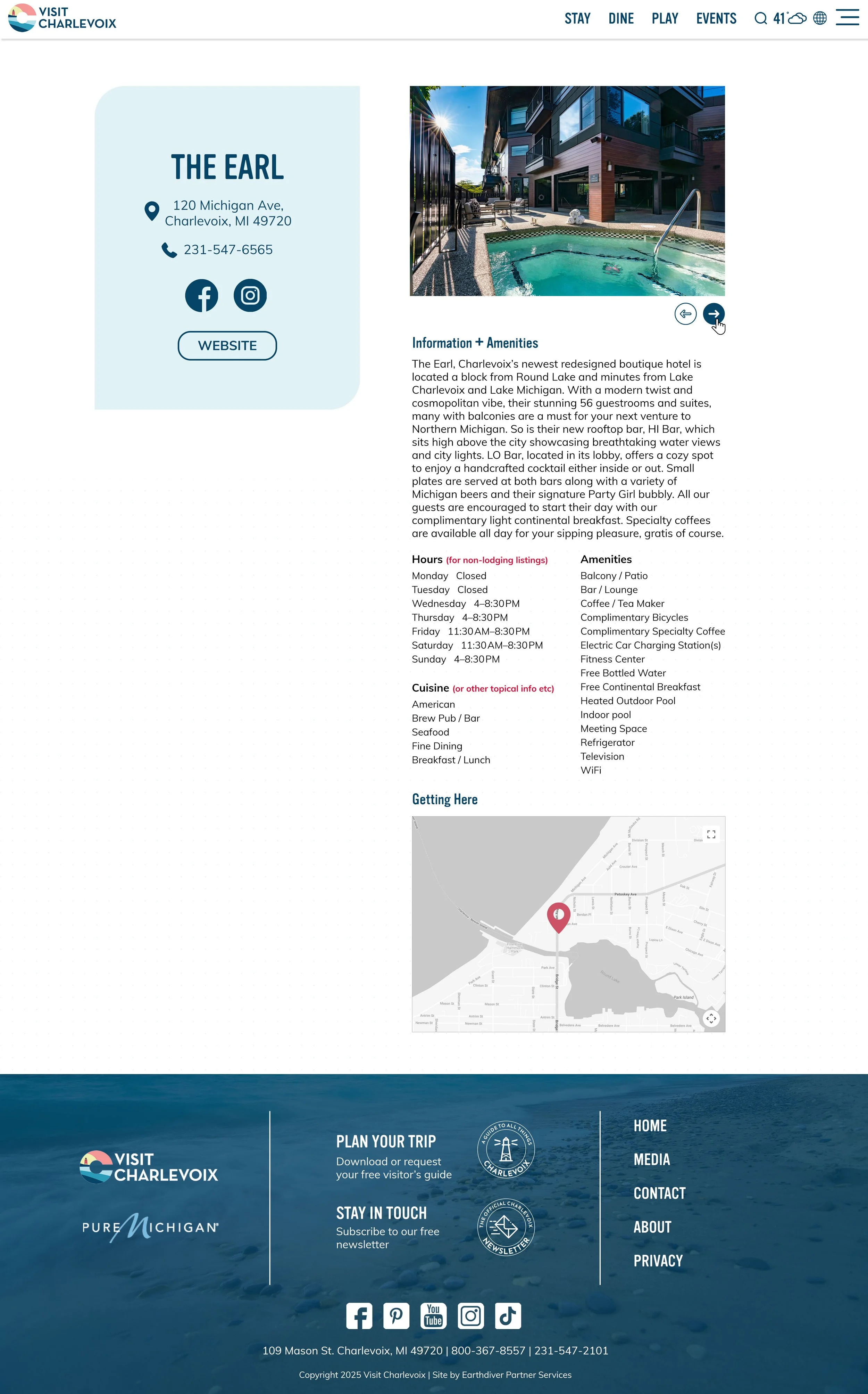
The Project
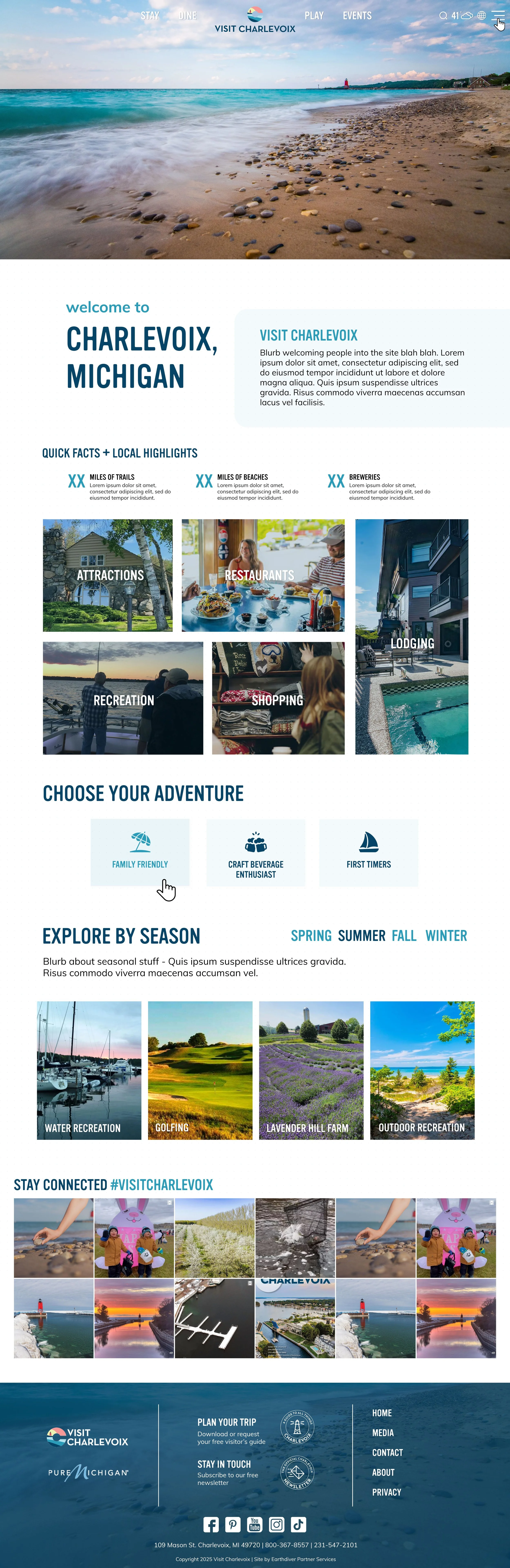
Visit Charlevoix is another longtime client whose website we last built in 2022. Like all sites I designed that long ago, I was ready to get my hands on this one and give it a much-needed facelift. Beyond aesthetics, the client’s main goal was to incorporate more calls to action throughout the site and drive more user engagement.
The Approach
Working within their existing brand identity, I wanted the site to feel familiar but updated, so we kept the current color palette but updated their fonts. To drive engagement on the homepage, we added in several new sections: the Quick Facts/ Local Highlights, Explore by Season, and the Choose Your Adventure buttons that were incorporated throughout all the landing pages.
Visit Charlevoix Redesign & Microsite
Client
Visit Charlevoix | Charlevoix, Michigan
Original site: 2022
Redesign: August 2025
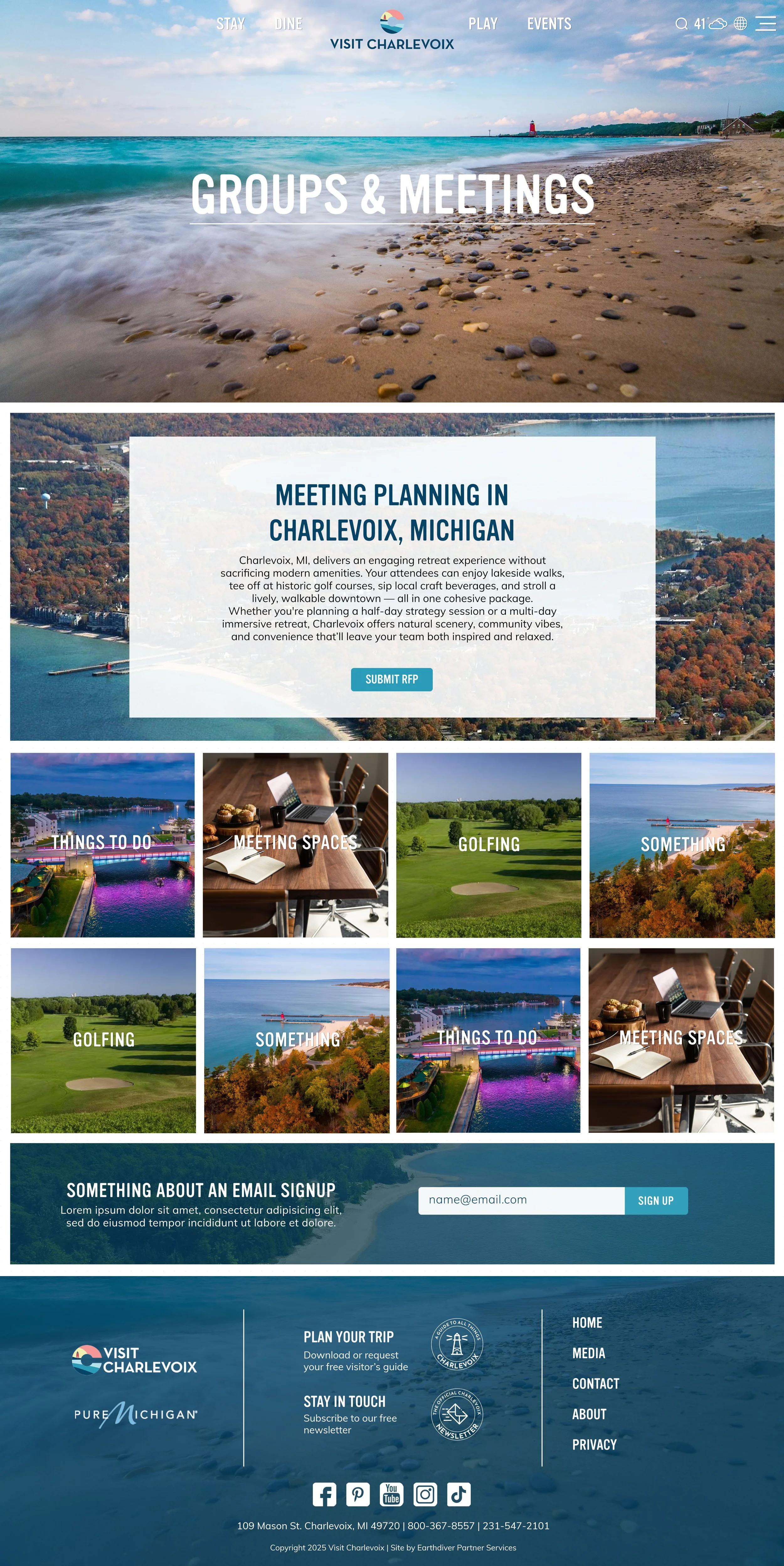
As part of the site refresh, Charlevoix wanted to create a dedicated Groups and Meetings ‘microsite’ to promote their growing number of meetings and conferences. They wanted a simple landing site that would maintain the same look and feel of the main tourism site where users could submit RFPs, search for lodging and meeting spaces, and find itineraries.
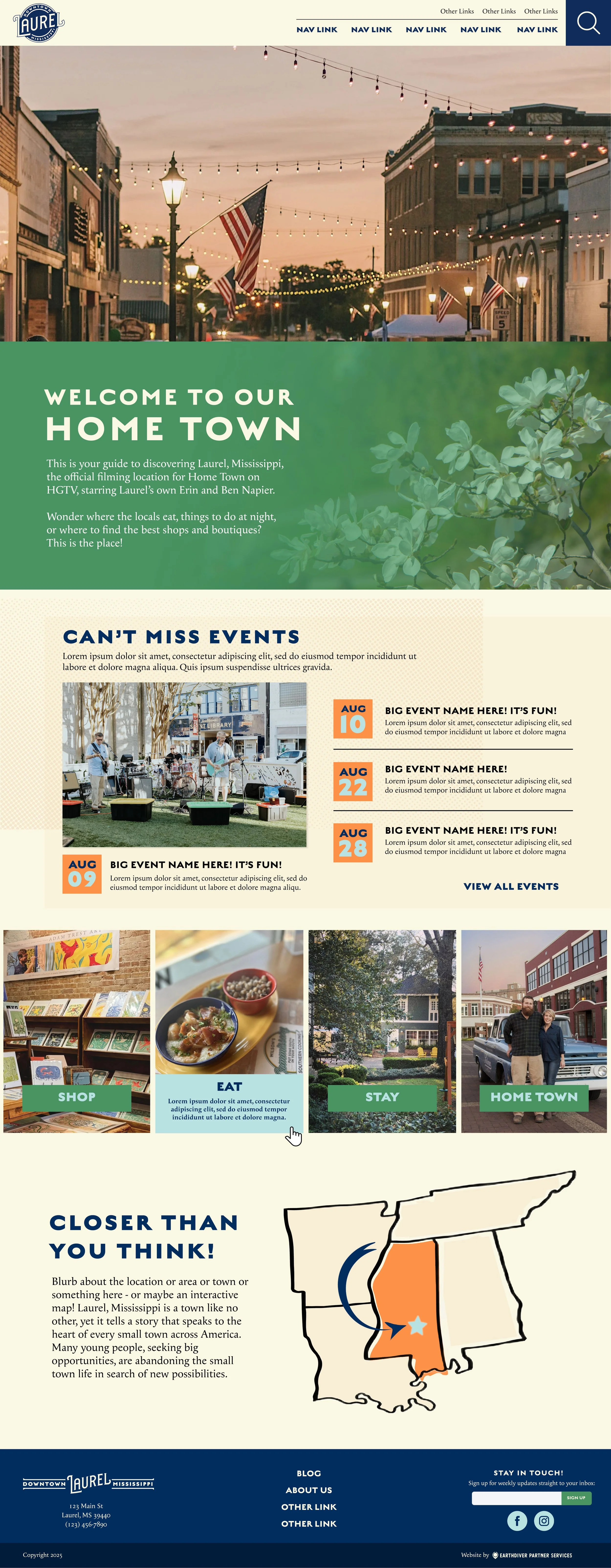
Reimagining Mississippi’s Favorite Home Town
The Project
Finally a project that made my mom excited about my work. In 2025, our team started working with Laurel, Mississippi, made famous on HGTV to overhaul two websites for their Downtown business district and their Main Street association.
The Approach
When you think small town Mississippi, you think Southern charm, and that’s how I wanted the website to feel. As visitors to Laurel tend to skew older, for the Main Street website we really focused on making the site easy to use with information easy to find. An interactive map helps people from out of town navigate the area.
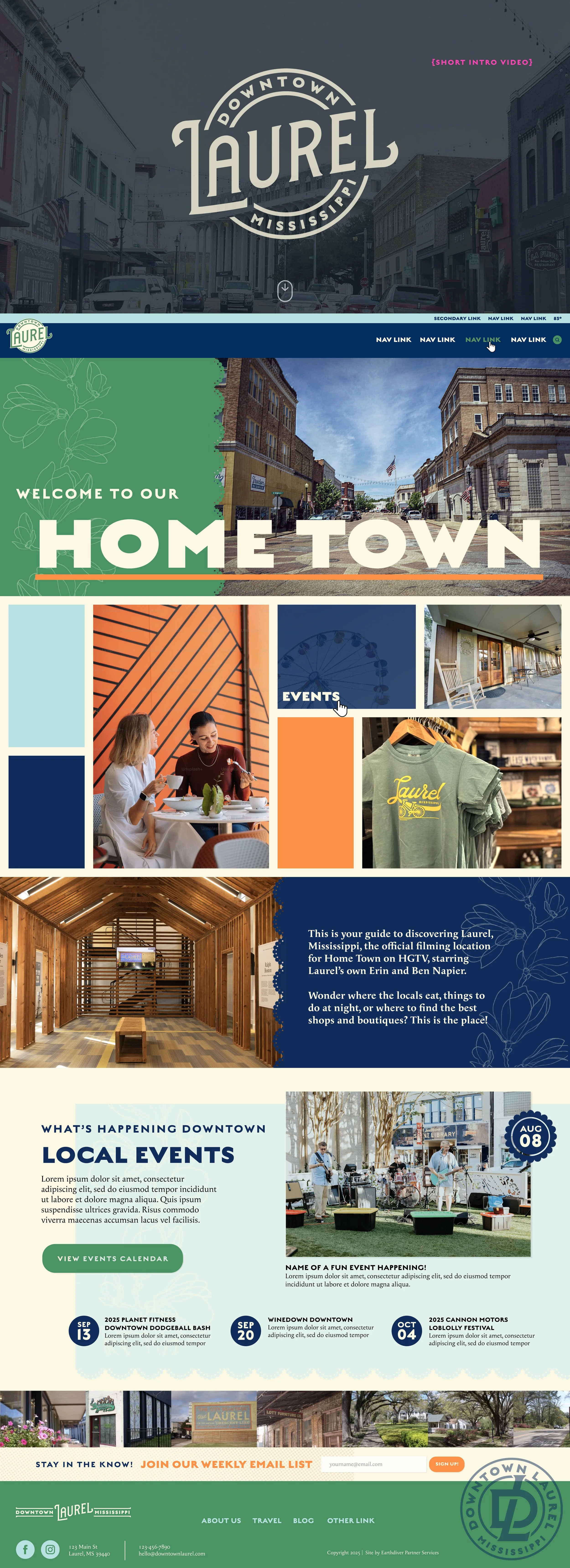
Client
Downtown Laurel & Laurel Main Street | Laurel, MS
2025-2026 (In progress)
The Project
We worked with the city of Sedona, Arizona, to create a brand new tourism website for the city - ScenicSedona.com. They wanted to showcase the city's obvious natural beauty, while highlighting more than just the typical red rock that the area is famous for, and putting a big emphasis on sustainability.
The Approach
To balance out the red tones that immediately come to mind when you think ‘Sedona’ (and that were used in the logo at the time), I chose a complementary green to bring to mind the other natural elements of their landscape - the shade of green you’ll find in sagebrush, in various desert cacti, in lizards, etc. To keep the focus on sustainability throughout the site, beyond adding a dedicated section of the site, we created the ‘Love it Like a Local’ section on the homepage to immediately steer visitors to important questions for making the most of the visit, responsibly.
Creating Scenic Sedona
Client
Sedona Tourism Office | Sedona, Arizona
2023-2026
At the beginning of this year, Sedona came to me with a new project: Create a set of landing ‘Adventure’ pages for their site.
Project
Who doesn’t love a potato? Working with Idaho Potato Museum to redesign their website in 2023 was a treat. They had a barely functioning, outdated website and wanted to incorporate an online store for their gift shop items, allow for mobile and online ordering for their cafe, and give the site a big dash of whimsy.
Approach
I really leaned into the quirky charm of the Museum, highlighting their mascot - the King Spud - throughout with nods to the crown and using a bright, playful colors.
Idaho Potato Museum
Client
Idaho Potato Museum | Blackfoot, Idaho
2023
A lot of the fun was in the details with this project. Blink and you might miss it, but look closer at the background pattern throughout the site and pick out your favorite spud - fried, chips, whole.
When the client mentioned a couple visitors had been so moved by their love of potatoes as to leave a poem, I knew we had to do something with that, and thus the Potato Poetry Corner was born.
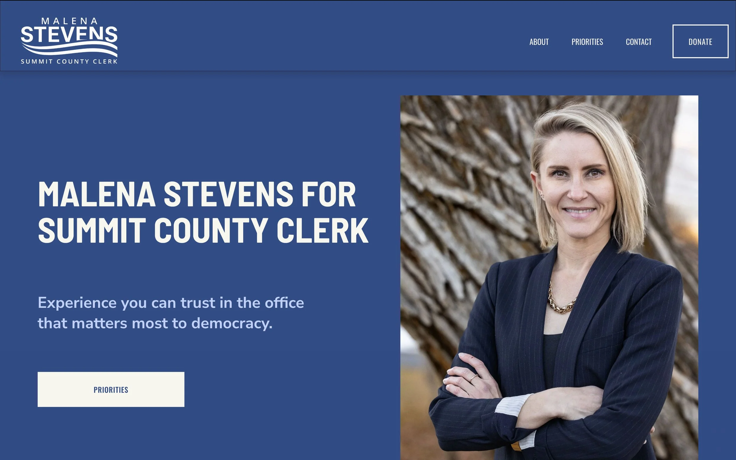
The Project
Getting asked to design and build a political campaign website was a first for me, but I love a new opportunity and challenge. Malena had a logo and a domain and not much else, and the goal was to get a site up and running within the week.
The Approach
Using the blue from her logo, the first step was to choose a few complementary accent colors and get her branding locked down. With a subtle nod toward the red, white and blue that’s all too common in political messaging but embracing a little more femininity, once I had a color palette decided it was full steam ahead getting the site built. We wanted her messaging to be clear and up front, and calls to action to donate and sign up for mailing lists easy to access.
Malena for Clerk
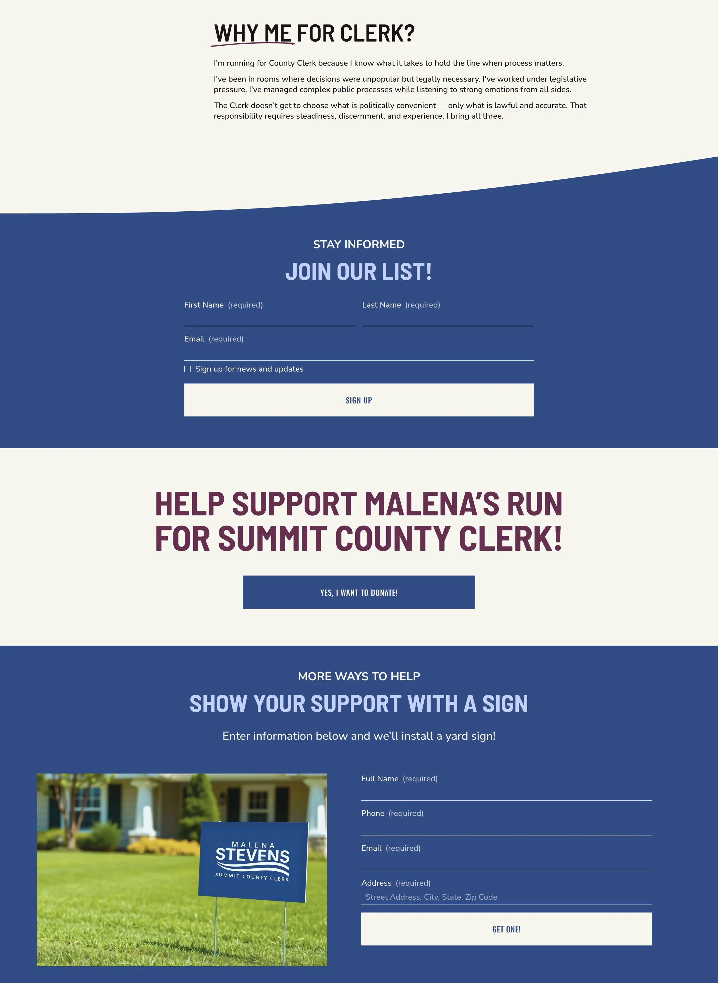
Client
Malena Stevens for Summit County Clerk
February 2026
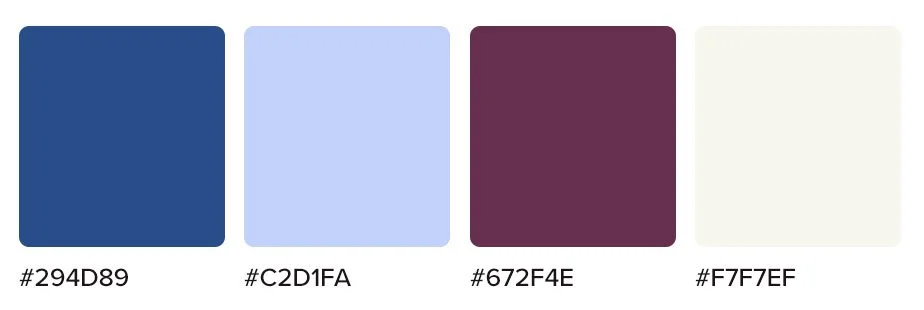
Color palette:
The Project
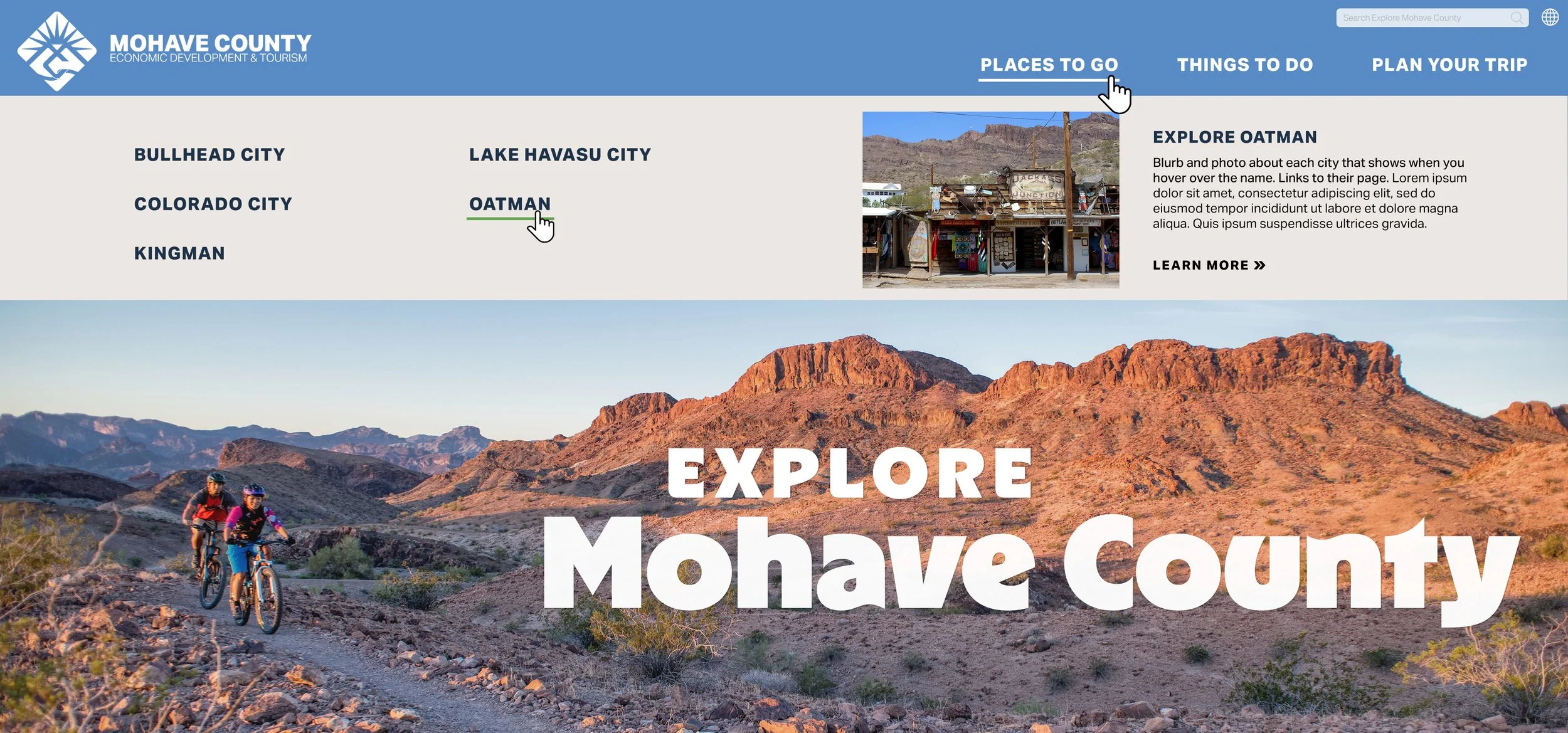
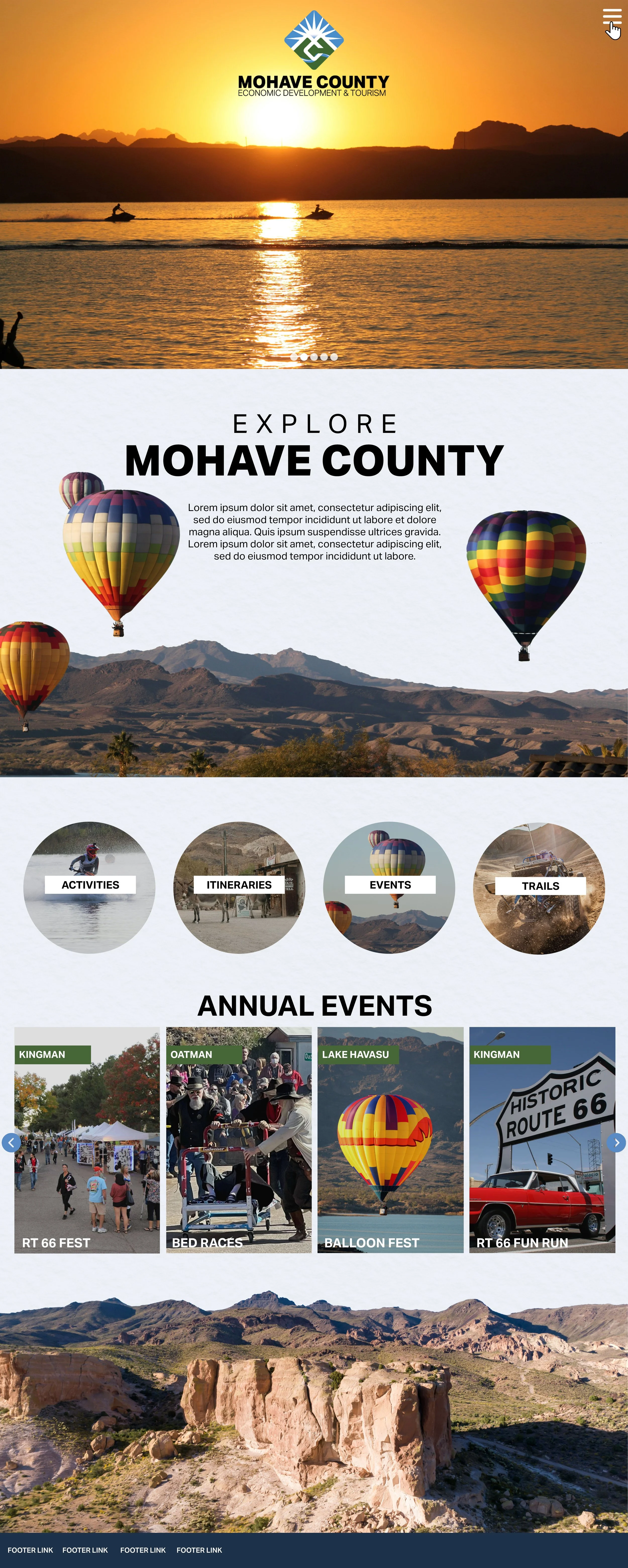
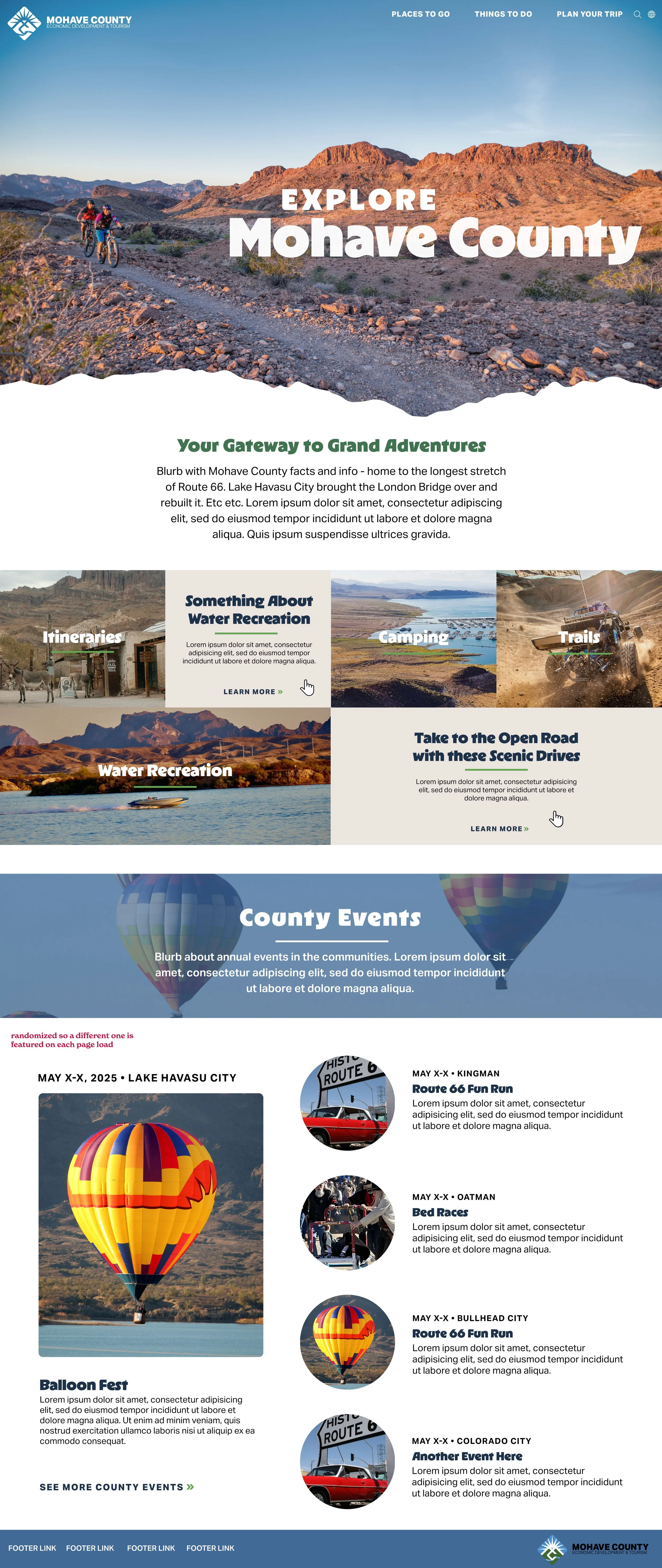
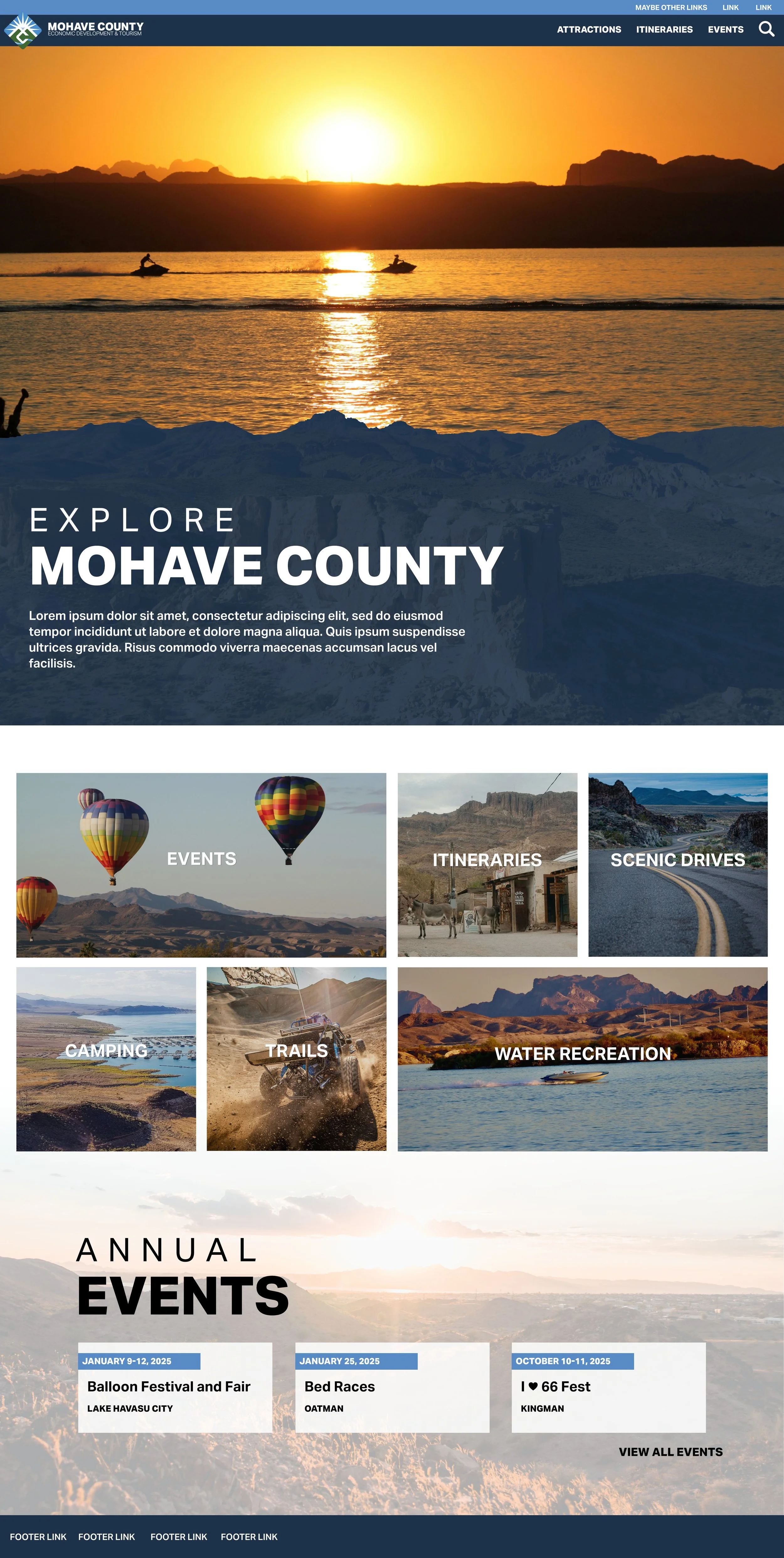
Our team has worked with a number of the cities within Mohave County on their websites for years and built lasting relationships with them, but Mohave County itself had no tourism website. Creating a website from scratch always presents its own unique challenges - with no prior content or framework to work from, you truly have a blank slate. I went through several rounds of homepage design iterations with their team while they figured out what kind of look they were going for, while behind the scenes our content developers were busy created a brand new site from the ground up.
The Approach
Unlike many of the DMO sites I work on, Mohave County opted to eschew the traditional dining and lodging sections of the site and leave those to the cities. We kept their site all about things to do, events and activities. With that in mind, my approach was simple: Make it fun! Make the site engaging, and Mohave County draw you in and somewhere you want to come recreate.
Creating Explore Mohave County
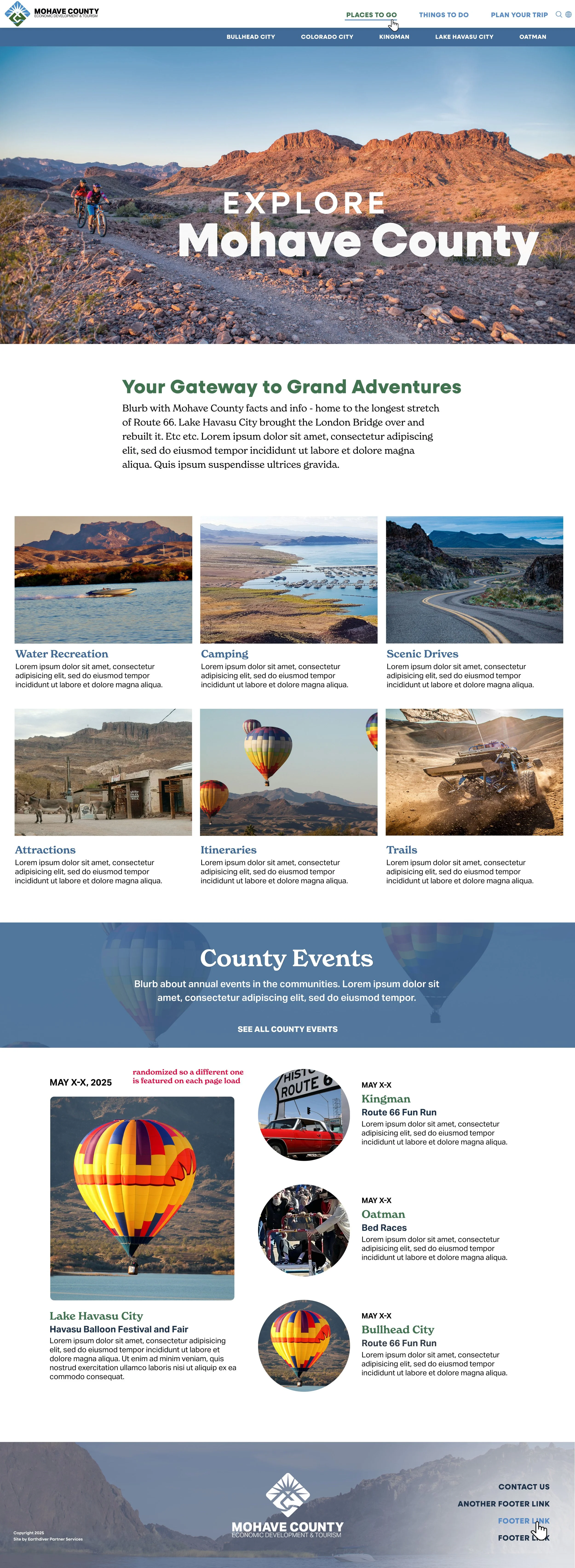
Client
Mohave County Economic Development & Tourism | Mohave County, Arizona
2025
Some projects and clients require more back and forth than others. Sometimes I nail it on the first time, other times we go through many iterations before client has what they want. I never mind giving a client multiple versions to look at - especially of a homepage, especially for a brand new website - after all, for me this is the most fun part of the project. I always think it’s fun to take a look back and see how the design evolved along the way.
The Project
Navajo Nation came to us with a barely functioning Wordpress site that they couldn’t update (a familiar situation). The immediate goal was to get them a working site, while also updating their brand identity and also paying homage to the incredibly rich cultural history.
The Approach
Working from the orange of their logo, I created a color palette that was bright and nodded to their culture and the area. I wanted the site to feel rich and textured, so I worked in multiple patterns and textures throughout the homepage. Because the Navajo Nation covers a staggering 27,000 miles, it’s unlike many of the sites I create for specific cities or counties, so I added in the Destinations carousel to highlight different areas within the Nation.
A New Look for Discover Navajo
Client
Discover Navajo | Navajo Nation
2025-2026 (in progress)
Color Palette: